Last updated on:
Reading time:
8 min read
Ultimate Guide to High-Converting Landing Pages in Framer

Zakir Ullah
Official Framer Expert
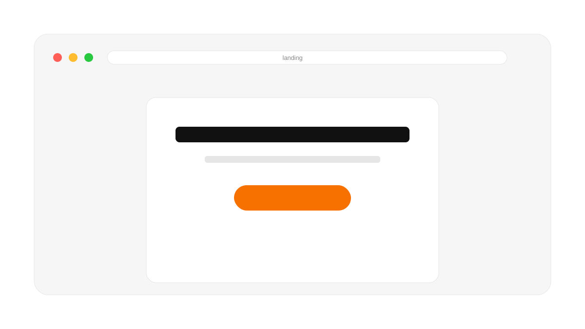
TRUSTED BY 50+ FOUNDERS
Your design + build partner
Design, Framer development, migration and SEO — founder-led, for US and EU teams.
TABLE OF CONTENTS
SUMMARIZE THIS
ARTICLE WITH AI
A Landing Page Should Have One Clear Conversion Goal
A landing page is not a smaller homepage. It is a focused path toward one action — booking a call, downloading a guide, buying a template, joining a waitlist, or starting a free trial. Every section should move the visitor closer to that single action. In Framer it’s easy to add visual polish, but conversion depends on message clarity: a beautiful page with a vague offer still underperforms a plain page with a sharp one.
The Ideal High-Converting Landing Page Flow
For a Framer template launch, a strong page might follow this sequence, where each section answers the visitor’s next natural question:
Hero with the main promise and primary CTA.
Preview screenshots that show what they’re getting.
Who it’s for so the right person self-identifies.
Benefits framed as outcomes, not features.
What’s included to make the value concrete.
Testimonials for social proof.
Pricing presented simply.
FAQ to clear final objections.
Final CTA to close.
Write a Specific, Momentum-Building Headline
Specificity is what builds momentum. Instead of “Build better websites faster,” try “Launch a premium SaaS landing page in Framer this weekend.” The second headline names the audience, the platform, the outcome, and the timeframe. A vague headline asks the visitor to do the work of imagining the benefit; a specific one hands it to them.
Place Proof Right Next to the CTA
Trust signals work hardest at the moment of decision. If your CTA asks visitors to pay, surround it with reassurance. Next to a “Buy template” button, add a line like “Includes 12 sections, lifetime updates, and mobile-ready layouts.” This removes hesitation at the exact instant it tends to appear.
Use Concrete Examples Instead of Abstract Benefits
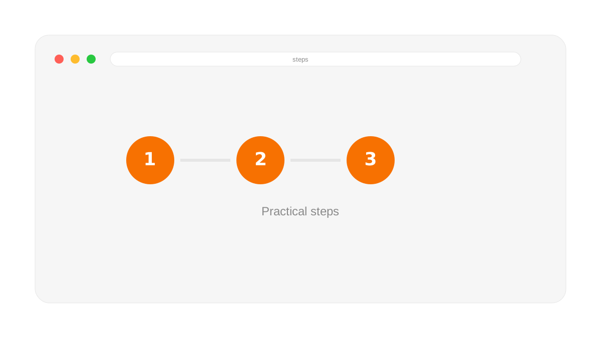
An abstract benefit like “save time” becomes far stronger when paired with a tangible example: “Start with ready-made hero, pricing, FAQ, and testimonial sections instead of designing each block from scratch.” Examples let the visitor picture the result, and picturing the result is most of what persuasion is.
Framer Build Tips for Landing Pages
Use reusable components for buttons, cards, badges, and FAQ rows so the page stays consistent and quick to edit.
Keep the primary CTA visually consistent everywhere it appears.
Optimize every screenshot so the page loads fast on mobile.
On mobile, remove decorative side elements that pull attention away from the offer.
Use sticky or repeated CTAs only when they genuinely help — not just because they look active.
A high-converting landing page feels like a guided conversation. Framer lets you design that conversation visually and test improvements quickly, so you can keep refining until the message clicks.
Frequently Asked Questions
How many CTAs should a landing page have?
One conversion goal, with the same primary CTA repeated at natural decision points. Competing offers split attention and lower conversion.
What’s the difference between a landing page and a homepage?
A homepage introduces the whole business and offers many paths; a landing page is built for one campaign and one action, with everything else stripped away.
Why is Framer good for landing pages?
Framer combines design-tool flexibility with instant publishing, so you can build a polished, fast landing page and iterate on it quickly based on real results.
Building for a software product? Pair this with how to build a high-converting SaaS website in Framer, and keep it fast using these Core Web Vitals tips.
WORKING ON THIS RIGHT NOW?
I run this exact process for US and EU teams — design, build, migration and the SEO work afterwards. Fixed quote in writing within three days.
NEED MORE INFO?
Frequently asked questions
How is a landing page different from a homepage?
A homepage serves many visitors with many intents. A landing page serves one intent with one action. That means removing navigation, cutting secondary links, and resisting the urge to explain everything the company does.
Should landing pages have navigation?
Generally no. Every nav link is an exit from the single path you are trying to protect. Keep the logo, drop the menu, and put anything genuinely necessary in the footer.
How long should a landing page be?
As long as it takes to answer the objections a buyer actually has, and no longer. Short pages work for cheap, obvious offers. Considered purchases need proof, specifics and objection handling — that takes room.



Founder-led Framer studio by Zakir Ullah — Official Framer Expert & Creator. Design, build, migrate, maintain and grow — led by Zakir from strategy through delivery.
Other
Powered by @Framer
Get 3 Months Framer Free
Let's Connect on Contra
Hire Me on Contra
Ask AI about Framerfry