Last updated on:
Reading time:
8 min read
How to Add an Interactive Pricing Table in Framer

Zakir Ullah
Official Framer Expert

TRUSTED BY 50+ FOUNDERS
Your design + build partner
Design, Framer development, migration and SEO — founder-led, for US and EU teams.
TABLE OF CONTENTS
SUMMARIZE THIS
ARTICLE WITH AI
A pricing table has one job: make the reader confident enough to pick. Most fail by trying to be complete instead — a dense feature matrix that answers every question except the one the visitor came with, which is "which of these is me?"
TL;DR
Three tiers is the practical maximum for a first view. More belongs in a comparison table below.
Recommend one plan visually. An unrecommended set of options increases hesitation.
The monthly/annual toggle is worth building — it converts and it is easy in Framer variants.
On mobile, stack and lead with the recommended plan. Do not shrink a three-column grid.
Name the plans after who they are for, not after metals.
Structure before styling
Decide three things before you open Framer. Who each plan is for, in a phrase. What the single differentiating feature is between adjacent tiers. And which plan you want most people to choose. If you cannot answer the third, your pricing page will not be able to either.
Plan names do real work here. "Starter, Growth, Scale" tells someone where they sit. "Bronze, Silver, Gold" tells them nothing except that there is a more expensive one.
Building it in Framer
The card component
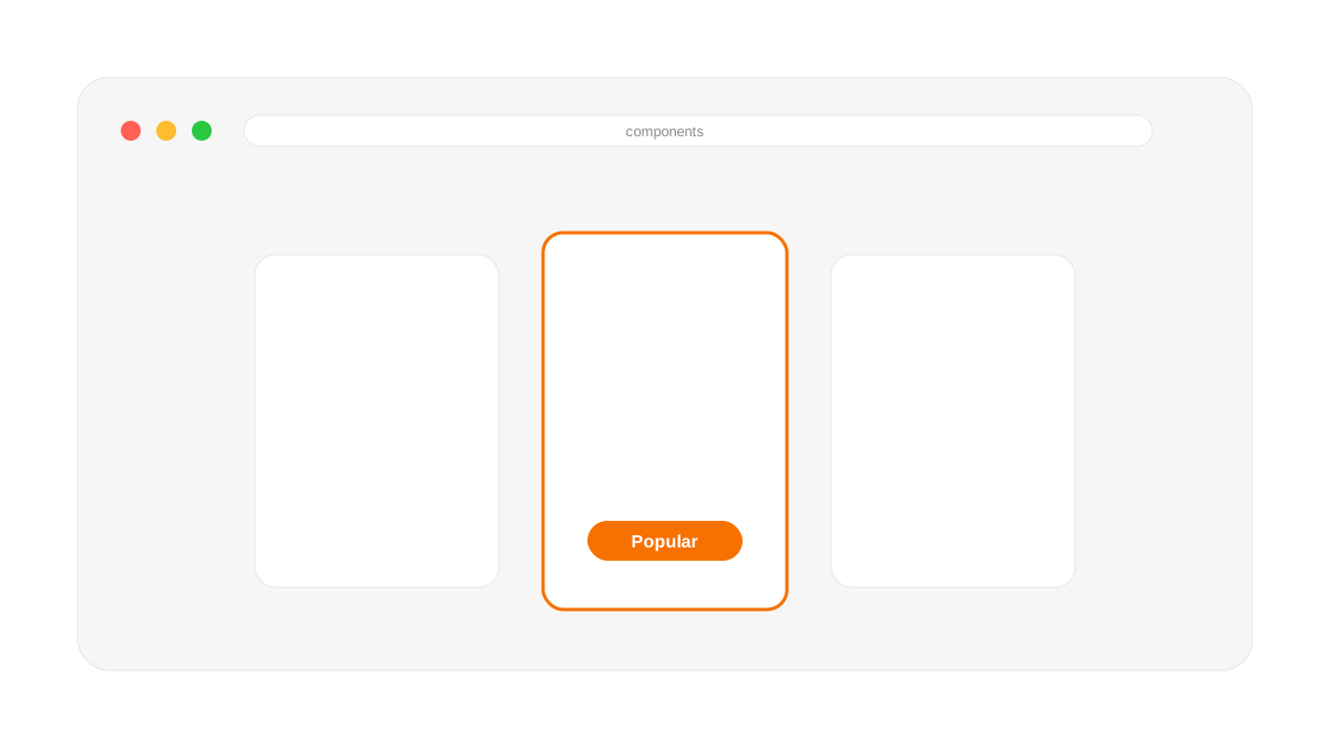
Build one card component with variants rather than three separate cards. At minimum you want a Default and a Recommended variant — the recommended one carries the accent border, the badge, and usually a filled rather than outlined button. Every property that differs between plans (name, price, feature list, button label) becomes a component property, so the three instances are the same component with different inputs.
One mechanic worth knowing: Framer doesn't require a separate variant per interactive state the way Figma does. Set the hover or tap interaction once on your Default variant, and Recommended inherits it automatically. You don't need to rebuild the hover state twice just because you have two card variants.
This matters more than it sounds. When you change the card design in four months, you change it once.
The monthly/annual toggle
Add a variant set to the section that swaps the price and the caption. The toggle button switches the parent variant, and all three cards update together. Two details people miss: show the annual saving explicitly ("$390/yr — save 20%") rather than making the reader do arithmetic, and make the toggle state obvious enough that nobody wonders which mode they are looking at.
Feature lists
Keep them to five or six lines per card, phrased as outcomes rather than specifications. "Unlimited pages" is a specification. "Add pages without asking us" is an outcome. If a feature needs explaining, it belongs in the comparison table further down the page, not on the card.
Mobile is where most pricing tables fail
A three-column grid squeezed to 390 pixels is unreadable, and shrinking the font is not a fix. Stack the cards vertically and put the recommended plan first — on mobile, first is the default choice in a way it is not on desktop. Keep each card's button inside the visible area rather than requiring a scroll past three cards to find the one that matters.
If you keep the annual toggle on mobile, make sure it is above the cards and large enough to hit with a thumb.
The parts of the page that are not the table
The table rarely closes on its own. What helps around it:
A one-line answer to "what if I need something custom?" with a link to a call.
The two or three objections you actually hear, answered plainly. Contract length, what happens if you cancel, whether the price changes later.
A comparison table below the cards for people who genuinely want the full matrix. Separate it, so it does not overwhelm the decision.
Social proof near the buttons, not stranded in a carousel further down.
Interactivity worth adding, and interactivity that is decoration
Worth it: the billing toggle, a seat or usage slider if your pricing genuinely varies by volume, and hover states that make the cards feel selectable. Decoration: animated number counters on prices, cards that flip, and staggered entrance animations that delay the reader seeing the numbers they came for.
A pricing page is the highest-intent page on most sites. Speed and clarity beat delight here more than anywhere else.
What to do next
Build the card as one component with variants before you build three cards — it is the difference between a fifteen-minute change and an afternoon. If you want to see the pattern in use, my own pricing page runs exactly this structure, and the CRO experiment library has the pricing-page tests worth running first.
WORKING ON THIS RIGHT NOW?
I run this exact process for US and EU teams — design, build, migration and the SEO work afterwards. Fixed quote in writing within three days.
NEED MORE INFO?
Frequently asked questions
How many pricing tiers should I show?
Three on first view. More belongs in a comparison table lower down. And recommend one visually — an unrecommended set of equal options increases hesitation rather than choice.
Should the recommended plan change based on the visitor's traffic source?
It can, and it's a legitimate lever — a visitor from a comparison-shopping ad might see a different default-highlighted tier than one from a brand search. Wire it through a URL parameter or your ad platform's dynamic content rather than hardcoding per-campaign page variants, which multiply maintenance fast.
How should pricing tables work on mobile?
Stack vertically and lead with the recommended plan — on mobile, first reads as the default. Never shrink a three-column grid to fit; the font size drops below readable long before the layout works.




Founder-led Framer studio by Zakir Ullah — Official Framer Expert & Creator. Design, build, migrate, maintain and grow — led by Zakir from strategy through delivery.
Other
Powered by @Framer
Get 3 Months Framer Free
Let's Connect on Contra
Hire Me on Contra
Ask AI about Framerfry